179prs_Game of Housing: mapping the playing field.
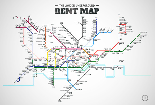
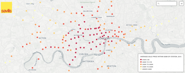 The new cartographers of London are seemingly mapping the housing crisis. By tube station. The ‘London Underground Rent Map’ by thrillest.com suffers the same fault as Savills ‘Average Property Prices Within 500m of Tube Stations’: both evaluate London by tube only. By way of example, Hackney had, until recently, no tube stations yet this didn’t thwart Hackney from ‘achieving(!?)’ the greatest property value increases in a London Borough over the past decade. Time to look beyond tube stations to other (Crossrail) links… perhaps we could map ‘London House Prices vs Boris bike docking station’.
SAY WHAT_!?

Leave a Reply
- 000off_WHAT_admin (240)
- 000off_WHAT_people (88)
- 000off_WHAT_process (141)
- 000off_WHAT_RADIO (22)
- 000off_WHAT_TV (2)
- Uncategorized (21)
- WHAT_projects (680)
- 000mot_House on Motiti (9)
- 012hil_Rooftop Nursery (7)
- 015ree_HOUSE RE-EDITED (2)
- 022gas_Gasometer Gamestore (1)
- 048per_Villa XX (63)
- 056mod_Modling House (6)
- 064man_Iceberg House (2)
- 069hil_CSLCoEPS+CC (15)
- 072hin_Hinemihi (48)
- 086tho_OuterSpace (8)
- 094cla_clapham road (3)
- 096agn_Agnes Riley (17)
- 101par_WHAT_developments (11)
- 105mos_WHAT_mosque (2)
- 107oly_Olympic Landmark (4)
- 111llf_Little London Fields (8)
- 114eoe_Earl of Essex (9)
- 116abk_Salakitecture (7)
- 119bar_BAR 574 (7)
- 121kra_What Library (8)
- 127sho_Shoreditch Overground (55)
- 128art_shoreditch underground (43)
- 129fil_La filature (17)
- 130pod_the film trailer (4)
- 132nnr_fishing living (2)
- 136eoe_The Thin House (3)
- 138won_Crime and the City Solution (1)
- 141sie_Freetown House (7)
- 145cos_Costa Del Thames (3)
- 146oly_Splash (2)
- 148log_ANIMALS AND ARCHITECTURE (2)
- 154sps_the invisible house (6)
- 160hyb_HYBRID/GE LONDON (1)
- 162ico_Hybrid/ge Amsterdam (5)
- 163pea_Perforated Housing Plaistow (2)
- 165sei_Istanbul Seismic Retrofit (2)
- 171leg_Legobusier (4)
- 173ota_Otamiemi (2)
- 177mot_Motiti Master Plan (3)
- 178col_Columnar Towers (2)
- 179prs_practice based research (88)
- 181man_Durusu Manege (2)
- 186cze_sports hall (6)
- 187pyl_Pylon film (1)
- 189bis_Grey Town Masterplan (2)
- 192bul_bouldergaria (5)
- 201mic_ (1)
- 203car_aircraft hangar (3)
- 206win_Winchester Temp Event Space (5)
- 209gub_Tesco Test Cot (2)
- 210qat_WHAT_arabia (2)
- 212ist_Evstanbul (2)
- 213bla_Radio Blablablarchitecture (3)
- 215ash_Ashgabat (4)
- 218coa_Coalwharf Housing (1)
- 221dog_Spotted Dog (8)
- 224nef_Istanbul Womens Dormitory (3)
- 226pea (2)
- 229bat_Bath House Extrusion (2)
- 230pra_Prague 14 (1)
- 231bel_Belgrade Bus and Railway Station (4)
- 236tur_Turkmenistan Pavilion (2)
- 237dog_The Barkitect (6)
- 240val_VALLANCE FC (3)
- 241mer_MERZ BAU (6)
- 242ham_MOD TUDOR HOUSE (1)
- 243sol_SolidSpace (1)
- 245zer_Smart Billboard (3)
- 252car_Atlas Carz (1)
- 253ven_TBC (1)
- 256meh_Simply Fresh (3)
- 260gla_badassymmetry glasses (1)
- 264mar_MARBLE RESEARCH (1)
- 265cos_Game of Homes (19)
- 270lau_HOTELAUNDRETTE (1)
- 276amt_Amtico (2)
- 283off_Container (1)
- 284abh_London Grotto (3)
- 289acc_ACC36 AMERICAS CUP PLATFORM (1)
- r006tan_Tānewhirinaki (1)
- WHAT_design research (7)
- WHAT_TV (4)
- 048PER_BATHROOM MOCK PIN UP!?
- Contact
- Say WHAT_!?
ARCHIVE
- September 2023
- May 2022
- April 2022
- October 2021
- May 2021
- April 2021
- March 2021
- February 2021
- September 2020
- July 2020
- June 2020
- February 2020
- September 2019
- August 2019
- June 2019
- February 2019
- January 2019
- December 2018
- November 2018
- October 2018
- June 2018
- May 2018
- April 2018
- March 2018
- November 2017
- August 2017
- July 2017
- June 2017
- May 2017
- April 2017
- March 2017
- February 2017
- December 2016
- November 2016
- September 2016
- July 2016
- June 2016
- April 2016
- March 2016
- February 2016
- January 2016
- December 2015
- November 2015
- October 2015
- September 2015
- August 2015
- July 2015
- June 2015
- May 2015
- April 2015
- March 2015
- February 2015
- January 2015
- December 2014
- November 2014
- October 2014
- September 2014
- August 2014
- July 2014
- June 2014
- May 2014
- April 2014
- March 2014
- February 2014
- December 2013
- November 2013
- October 2013
- September 2013
- August 2013
- July 2013
- June 2013
- May 2013
- April 2013
- March 2013
- February 2013
- January 2013
- December 2012
- November 2012
- October 2012
- September 2012
- August 2012
- July 2012
- June 2012
- May 2012
- April 2012
- March 2012
- February 2012
- January 2012
- December 2011
- November 2011
- October 2011
- September 2011
- August 2011
- July 2011
- June 2011
- May 2011
- April 2011
- March 2011
- February 2011
- January 2011
- December 2010
- November 2010
- October 2010
- September 2010
- August 2010
- July 2010
- June 2010
- February 2010
- October 2009
- May 2007
- December 1996